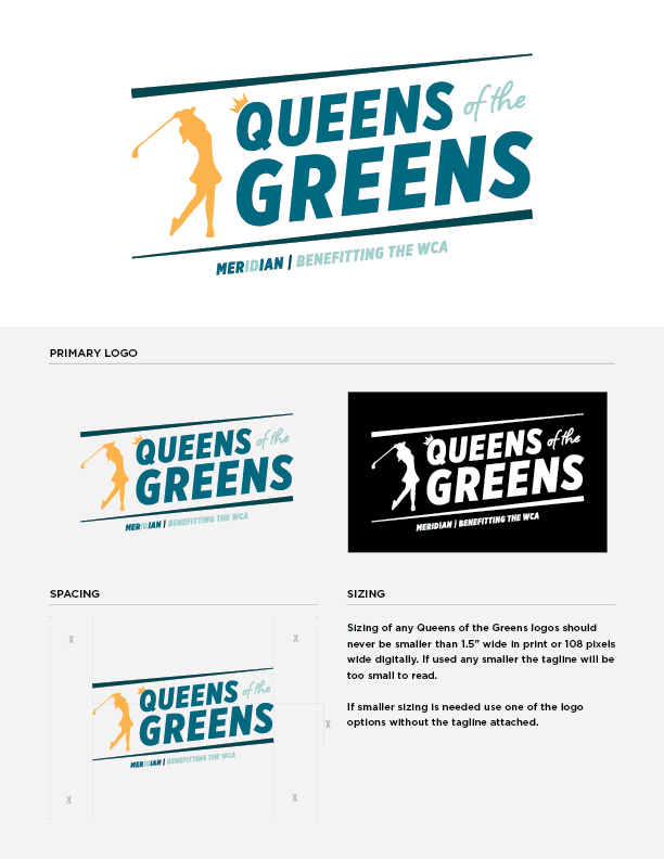
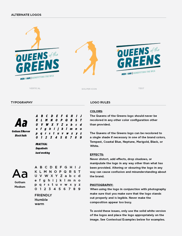
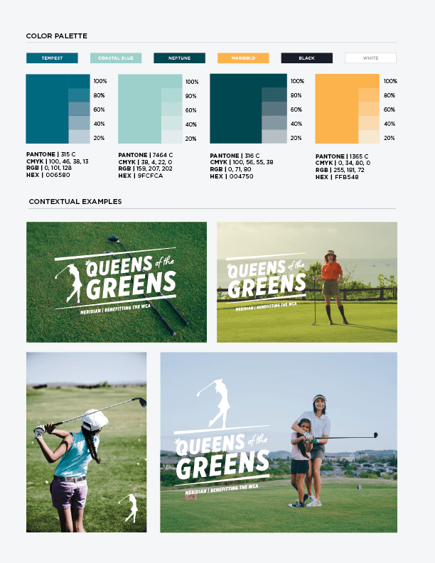
When the Meridian Chamber of Commerce came to SOLV with an idea for a new women's golf event, Queens of the Greens, they needed more than just a logo. They needed a complete visual brand that would capture the essence of their event and help it stand out in a competitive market. That's where Matt McLaughlin, our creative designer, comes in. In this blog post, we'll take you through the process he went through to create a visual brand that perfectly represents Queens of the Greens.
First, you need to think about your brand personality before making any visual decisions. What are the values of the brand? What is the tone you want to set? For Queens of the Greens, we wanted to capture the fun and excitement of the event while still conveying a sense of sophistication. Matt asked each member of the decision-making group to take a brand archetype quiz in order to capture more of the personality the brand should convey.
With those results in mind, he went on to create different logo options as a base, then gathered input to choose a direction and refine the design - incorporating feedback from all the decision-makers and using his creative expertise to shape the finished product into something that conveys the right feeling AND works as a sub-brand of the Meridian Chamber.
Matt says, "it's important to trust your designer when there is a group of people whose views need to be heard. In the case of Queens of the Greens, we had a great group at the Chamber who all had their own ideas about what the brand should look like. I tried to incorporate as many ideas as I could without making it look like a novelty logo, because that's not what would be best for the Chamber.
You see a lot of logos out there that are super trendy and it’s cool for right now. But in five to 10 years, it's not going to work as well. And I think with what the ladies are trying to do over at the Meridian Chamber, getting this started, you don't want a logo that doesn't stand the test of time."
It's essential to set aside any preconceived notions you might have of what the logo should look like, especially if you're searching online to get those ideas. Matt adds, "when you Google or do a search for inspiration, like I think a lot of designers do, you don't want to go with the first things that pop up - why would I give you something that's already out there? Why would you just do the same thing that everybody else is doing?
Because I think the biggest problem, especially with design now is, if you've thought of it, somebody's already done it. I don't think any idea is 100% original anymore, which is why you have to make your own spin on it."
Once you have a clear understanding of your brand personality, it's time to start thinking about how you will use your brand visuals. Will they be used on social media? On marketing collateral? At the event itself? It's important to consider all of the ways your brand will be used when designing it.


According to Matt, in order to create a strong design, "you always have to start by designing in black and white. And I think that's the issue that I see with everybody who thinks that they're a designer now is they're not designing for all types of media. You have to think about the bigger picture. What could this look like in social media? What would your icon be, what would this look like as your header image? What if you put it on a t-shirt? How will the logo look in various sizes? Are there different logo arrangements?
I think trying to make something versatile is really important, as well as trying to make it unique and fun. And I guess I'm also thinking of future needs - if I were to make this a motion graphic at some point, how would it work? I want to give the customer something that will be easy to use and give a lot of wow appeal!"
Besides the opportunity to help the Meridian Chamber raise funds for the Boise WCA (Women's and Children's Association), which is a cause we're deeply honored to support - it's always great when we get to go above and beyond on a creative project. Matt says, "I think what was fun is that the decision-makers in the process were very trusting in letting me do what I needed to do - they let the professionals do their job versus micromanaging and saying, I want this, and make something like this.
It's also exciting when you're starting a whole project from the ground up. I got to create all the brand standards and logo usage rules that help them make the most of their new brand - so they get a better understanding of what the brand is versus just giving someone a logo and nothing more. It's giving the full package, because I don't think a logo is good enough anymore. It's the brand, what does it mean and how does it all work together?"


According to Matt, the most important thing you need to think about is, "what describes my brand? Descriptors are the biggest thing to help clarify what style you're looking for, because there are 1,000,001 ways to do a logo. The way that I decided to do the Queens of the Greens logo was grounded in the personality traits that the people who were in charge of it wanted for the event. That's what makes your branding authentic."
You can look search on Google or Pinterest for inspiration, but it's best to avoid looking specifically for logo designs. Instead, search for images that convey the emotional and personality traits you're trying to convey. As Matt points out, "Usually when people are looking up references, they find the one that they really like and they say, I want that. But then it's not your own unique brand. You're just copying what somebody else has already created."
Matt told us people may not realize all the thought that goes into branding and logo design: "Creating a brand is more introspective than people think. You want something that represents you and your company or your brand as authentically as possible - something that doesn't feel forced. If you're looking at logo ideas from Google, maybe that doesn't really represent what you're doing.
And then you end up with a completely different meaning or feeling because you started with this notion of, 'I want a green logo', but maybe green isn't the color for your company. Maybe that doesn't really represent the mood that you're all about. I think there's a lot more emotion and personality that goes into branding than people are aware of."
Finally, Matt reminds us that a brand is so much more than a logo. "Your brand is your identity. It's what makes you unique and sets you apart from the competition. When it's done right, you'll stand out and be remembered long after the event is over."
We SOLV that! It starts with a conversation about your needs - call 208.342.3676 or fill out our contact form and we'll help you figure out your next steps.


Copyright © 2025 SOLV, All Rights Reserved
Privacy Policy & Cookie Policy